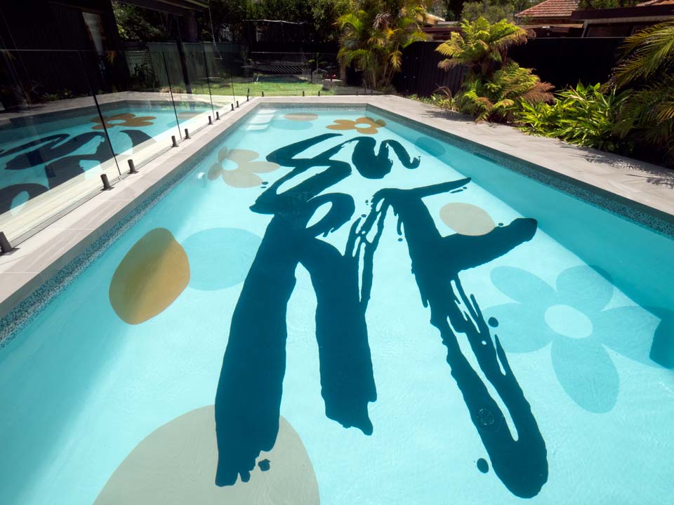
A designer swimming pool mural will make a big statement to your home so it’s worth doing some homework to make sure the final result exceeds your expectations.
Shannon Vos, an Interior Designer and winner of Channel Nine’s THE BLOCK in 2014 approached Colormaker Industries, manufacturer of LUXAPOOL Epoxy, Australia’s No 1 Trusted Swimming Pool Paint, for assistance with designer colours for an underwater pool mural. At our meeting, Shannon said that he wanted ”an explosion of colour in the pool” to complement a lush green garden and provide a counterbalance to a black on black home renovation.
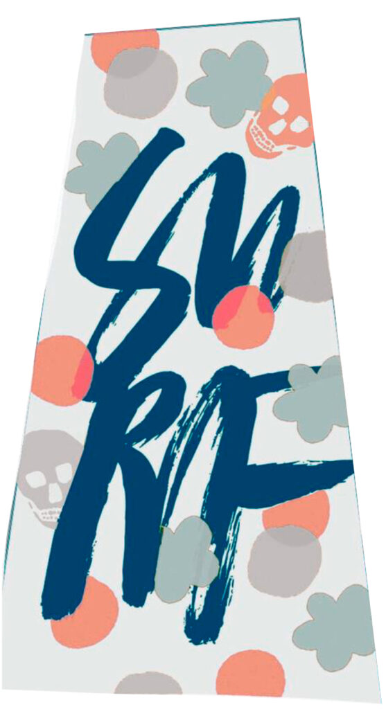
Blacklist Studio design concept for Shannon Vos pool mural project
Shannon presented the design concept, created by the talented Nathan Johnson of Blacklist Studio for discussion. In addition to the 25 colours available in the LUXAPOOL Epoxy Pool Paint colour range, Colormaker’s technical team formulated an additional 13 bespoke colours for design consideration. Shannon and Nathan had clear ideas for the feel of the design and required guidance in pool paint application together with insights on how colour behaves underwater.
When considering a colour palette for a pool mural it is really helpful to keep in mind the interaction of water and colour. There are essentially two effects you need to know about to make good colour choices.
- Colour shifts hue under water: Water filters out hues. Reds are filtered out first (most strongly), followed by orange, then yellow, green and so on. The deeper the water the greater the colour shift. This can be difficult to imagine so Colormaker created coloured sample tiles for Shannon to place under water for assessment. The photos below show the how the pool tile colour shifts hue under 1.5 m of water for a range of colours including purple, pink, yellow and orange.
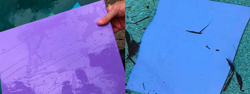
Sample 1 Out of water (left) and under water (right). Notice that the red in the purple tile is filtered out under water leaving blue.
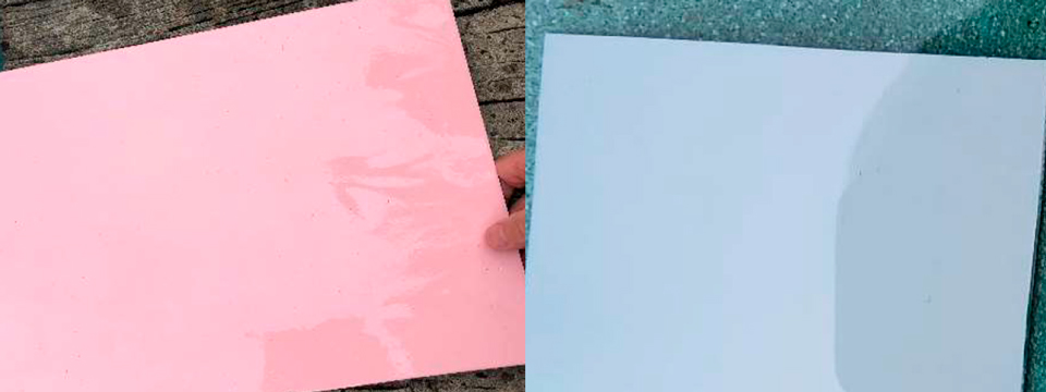
Sample 4 out of water (left) and under water (right). Red filtering by water results in the pink tile turning grey.
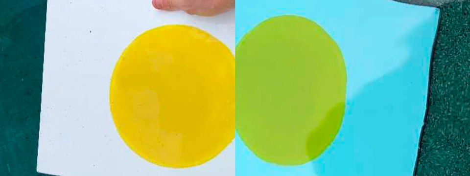
Sample 6 out of water (left) and under water (right). Only slight yellow filtering under 1.5 m of water.
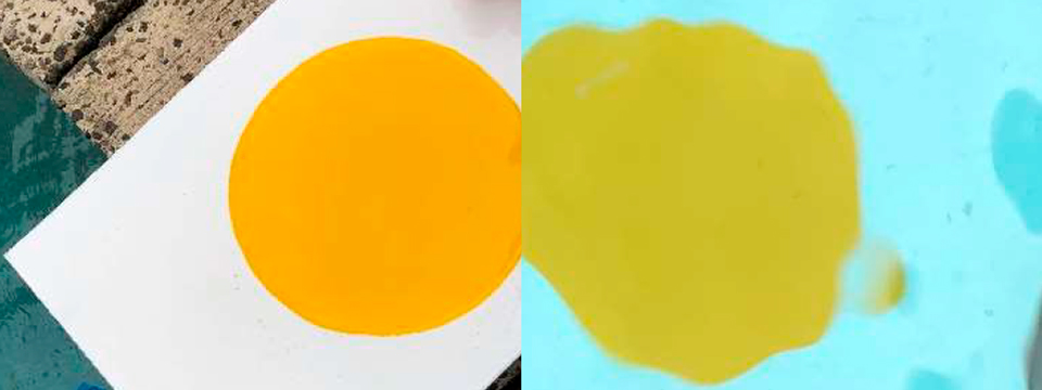
Sample 7 out of water (left) and under water (right). Mostly red filtering and slight yellow filtering under 1.5 m of water.
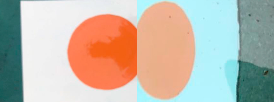
Sample 11 out of water (left) and under water (right).
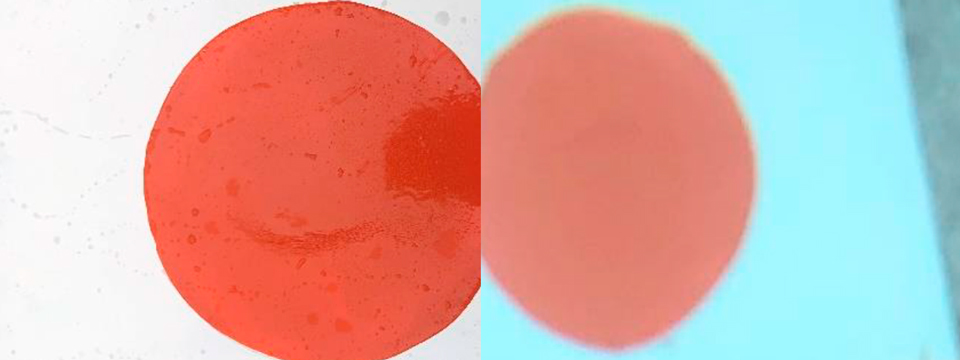
Sample 12 out of water (left) and under water (right).
- Loss of colour contrast under water: Water not only filters out colour, it also filters out light. Colour not only shifts under water to another hue it also desaturates (loss of hue). This is exactly the same effect that overcast days (with less light) have on colour. Colours have a grey tone on overcast days and under water.
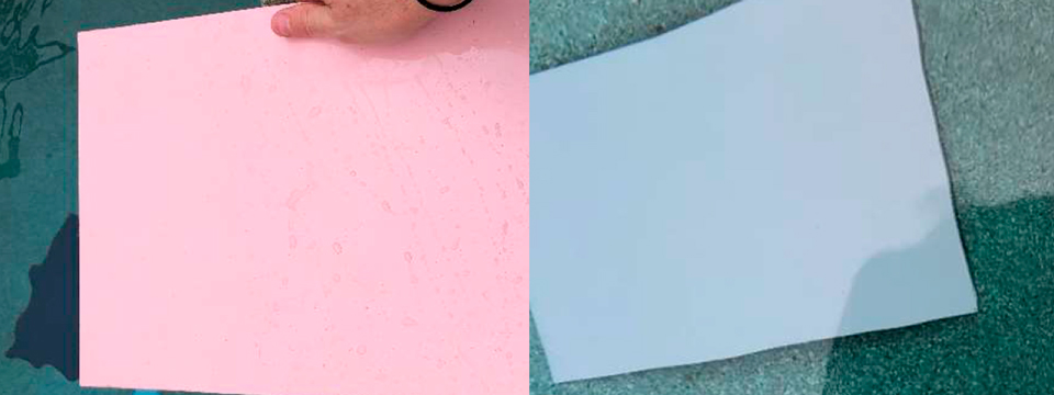
Sample 5 out of water (left) and under water (right).
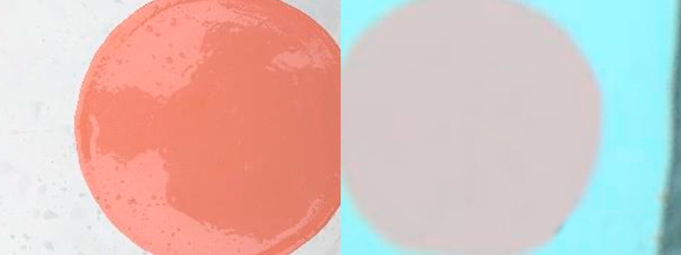
Sample 8 out of water (left) and under water (right).
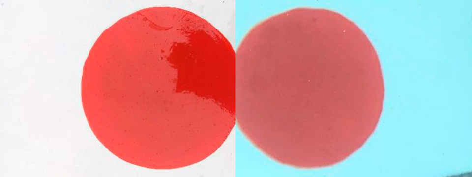
Sample 10 out of water (left) and under water (right).
Loss of contrast is more noticeable with some colour combinations. Samples 5 and 8 are shown below side by side (out of the water). Notice there is good contrast between these two colours when viewed out of the water:
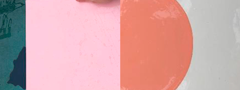
Samples 5 & 8 shown out of the water.
When viewed under water samples 5 & 8 (shown below) not only shift in hue but also lose contrast.
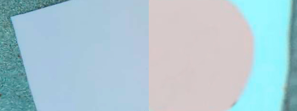
Samples 5 & 8 shown under water.
Your pool mural design needs to take into consideration loss of contrast between some colours. At Colormaker these colour decisions are simplified with the use of LUXAPOOL Epoxy coloured pool tiles.
These insights led Shannon and Nathan to make some design adjustments including changing the background colour from light grey to white to improve contrast so the colours pop.
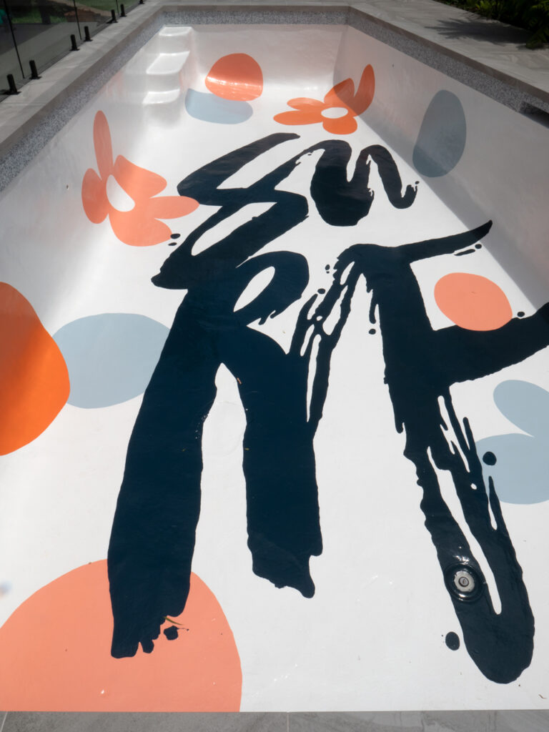
Revised pool mural design by Blacklist Studio for Shannon Vos painted in LUXAPOOL Epoxy Swimming Pool Paint.
With clever colour selection and design, Shannon and Nathan overcame the limitations of colour expression under water to create a striking design.
Contact Colormaker Industries for more information on choosing pool colours. Further details can be found at luxapool.com.au


